
More
- Jun 30, 2025
- 2 min read
Howdy, folks. Saturday night, the rambles on the iPad. Improvising sort of, but picking up where I left off with my newsletter. Thought I would write more about this illustration/concept art piece I did for a film client. Along with storyboards, it’s what I do in the film business, working with film directors and producers, plus sync music/music production. Can’t forget that too. Don’t write much about music, but maybe I will one day.
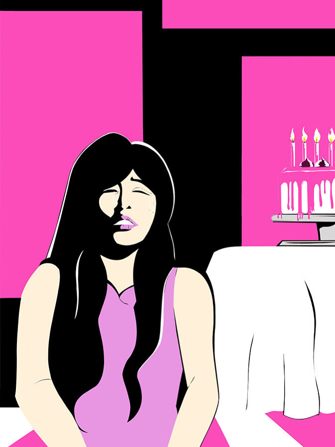
What is concept art? I might screw up the definition, but it is when an artist, creates an illustration or a series of illustrations for a film project, that gives a script or a story/plot a visual look; reflects the overall, visual look of the film/tv/intellectual property/franchises; visual renderings of particular scenes from the script with characters of the script interacting in scenes or just landscapes or interior/exterior visuals of scenery that are also in the script too. Before a single frame is shot, concept art and storyboards gives the film/ film project a visual look that the film director, producer and crew/staff, will have to prepare/build/construct/design sets and costumes before filming commence or the cinematographer prepares his/her shots. Nothing set in stone in terms of all the concept art to be used in the film project, but a foundation to anchor the film, to prepare, to build, to give the film a structure to build upon, along with the script, subject to change. In this case, this job I did for a client, it was a combo of designing/illustrating the main character of the script in that scene that you see in this blog and creating the setting of the scene, giving that particular scene a visual look.
Rambling, could be. Pause, take a beat . In retrospect, I did the best I could. Looked at lot of references to make the work looked the best to my ability. I did this illustration next to another one that had a different scene, a different angle shot and a different color scheme. Where the one above was in pink, the second one had a light blue background. Wanted to create contrast between the two. Something I learned from the pros in the comic book business. When you have each panel next to each other, when there is a transition from shot to shot, change up the angles. Contrast. Give it contrast. Did the same with color scheme. Pink, the dominant color in this piece, light blue in the other one. Maybe I will post both of them next to each other, so you can get an idea what I am writing about.
Well, gotta run. Finish this up. Hope to touch upon this subject in another newsletter and tighten up the writing a bit. Riffing off the top of my head. I will be around in July with a few more rambles. Stay cool, everybody. Hot out there. Got the a/cs on. A lot of projects going on. Talk to you soon and all the best.


Comments